
Color is the single most powerful tool we have to instantly transform a space, shift a mood, and reflect the current cultural moment. As we look ahead, the predicted Color Trends for 2026 signal a collective desire for balance: a need for grounding connection to nature combined with a subtle injection of optimism and playful expression.
For the Cozy Crafted home, this shift means moving beyond basic neutrals to embrace richer, earthier shades that provide warmth, depth, and a sense of sanctuary. These palettes are designed not just to be aesthetically pleasing, but to support well-being and a mindful lifestyle.
This comprehensive guide breaks down the three most important color directions for 2026. We’ll show you how to successfully integrate these defining shades—from wall paint to soft furnishings—to ensure your home aesthetic remains fresh, contemporary, and, above all, deeply cozy.
2. THE THREE DOMINANT COLOR DIRECTIONS FOR 2026
The forecasts for 2026 converge around three distinct, yet complementary, themes that speak to our desire for balance, comfort, and the embrace of the natural world.
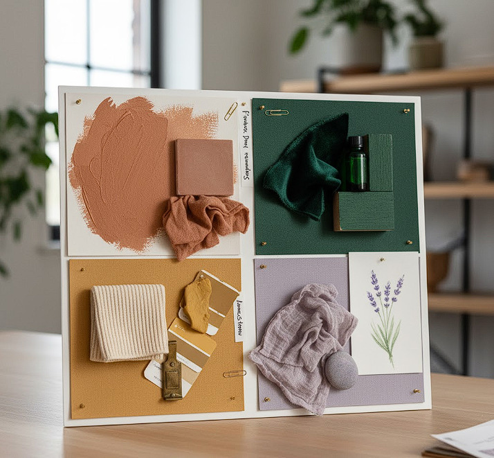
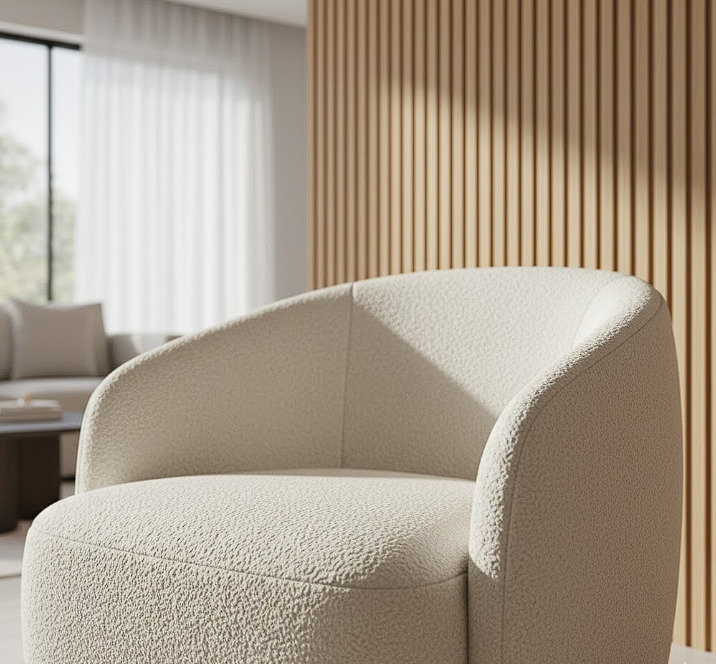
2.1. Grounded Earth: The Comfort Palette
This trend is a deep dive into the natural, unbleached colors of the earth, providing an immediate sense of stability and warmth.
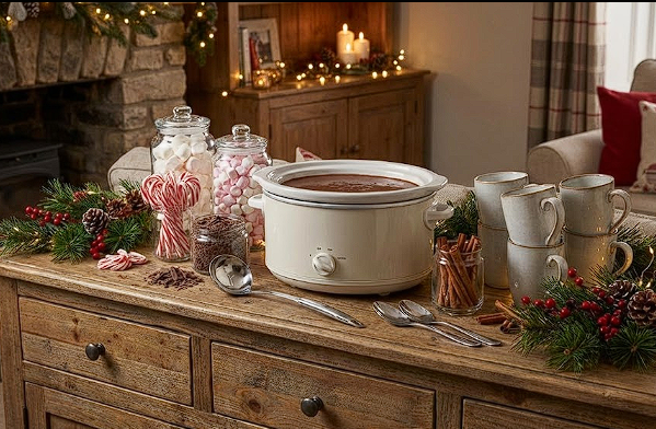
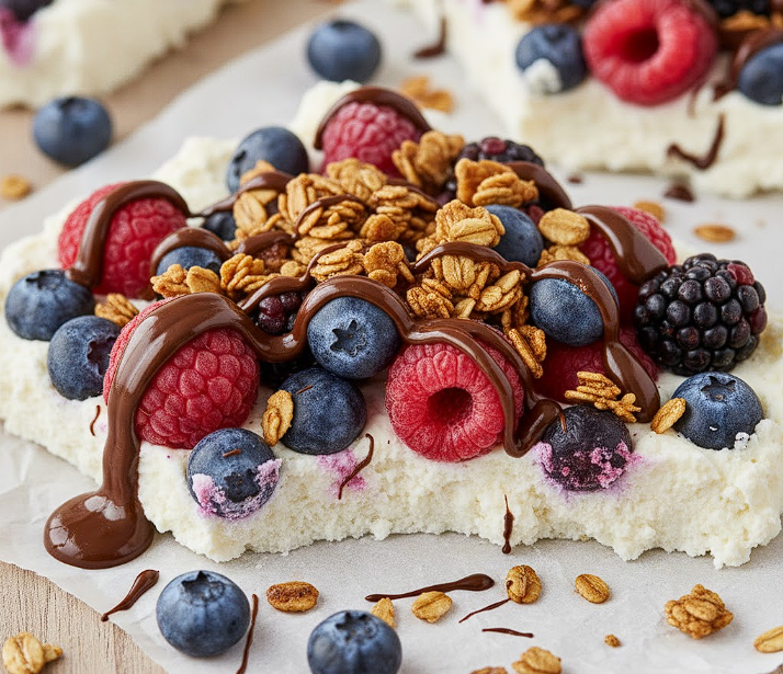
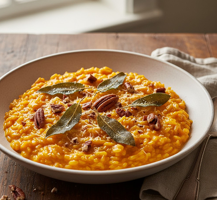
- Key Shades: Deep Terracotta, Muted Clay, Sandstone Beige, and Burnt Sienna.
- Feeling: Secure, rustic, and profoundly grounding. Perfect for living rooms and kitchens where comfort is key.
- Application: Excellent for accent walls in textured finishes (like limewash), terracotta pottery, and natural linen upholstery. Textured finishes like limewash.
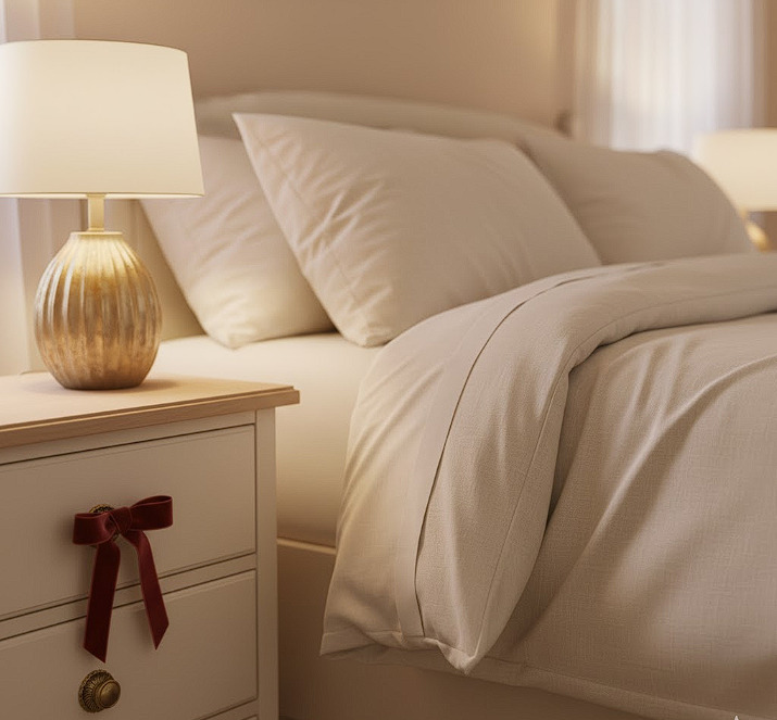
2.2. Restorative Greens: The Sanctuary Palette
A direct response to the Biophilic Design trend, these greens are saturated, calming, and reflective of a deep forest or a quiet marsh.
- Key Shades: Deep Moss, Forest Green, Soft Sage, and Olive Drab.
- Feeling: Calming, fresh, and restorative. Ideal for bedrooms and home offices to foster concentration and peace.
- Application: Use on cabinetry, trim, or as the main color in a bedroom. Pair with dark woods for an elegant, masculine feel or light woods for a soft, Scandinavian vibe.
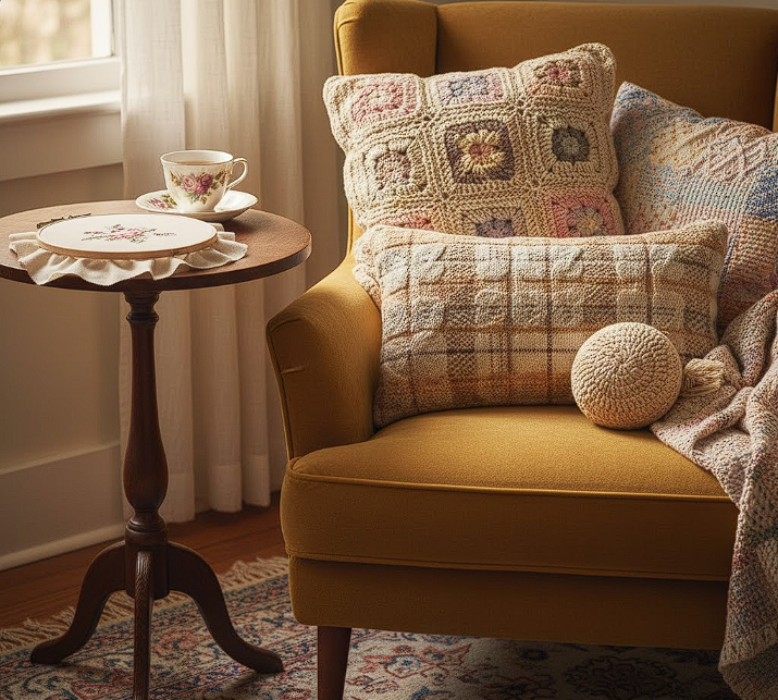
2.3. Muted Optimism: The Expression Palette
These are expressive colors, but filtered through a soft, hazy lens, avoiding the stark brightness of past decades. They add personality without demanding attention.
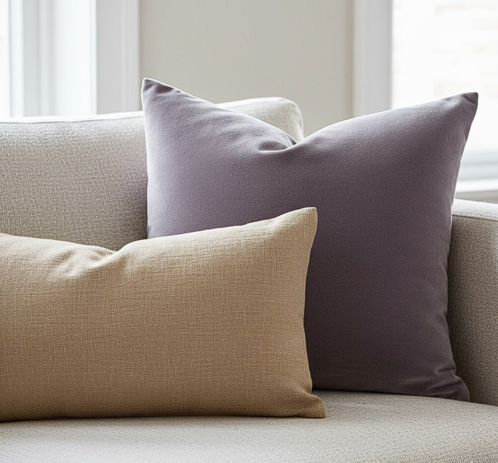
- Key Shades: Dusty Lilac, Buttery Yellow, Soft Coral, and Muted Lavender.
- Feeling: Subtle joy, creativity, and lightheartedness.
- Application: Best used as carefully selected accents: throw pillows, statement vases, an art piece, or painted furniture flips. Painted furniture flips.
3. USING COLOR TO DEFINE ZONES AND MOOD
The modern cozy home often requires spaces to serve multiple functions. Color can be used as a smart, low-cost architectural tool to define these zones.
The Power of Monochromatic Depth
Instead of switching colors aggressively, use varying shades of a single color within one room. For example, use a lighter Terracotta on the walls and a darker Burnt Sienna on the trim or a bookshelf. This creates visual interest and depth without feeling busy.
The Accent Wall Evolution
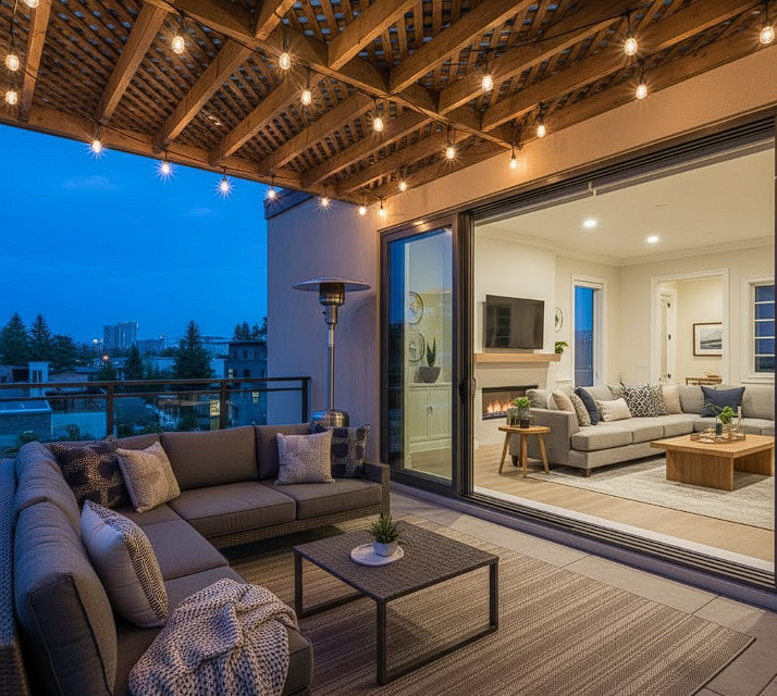
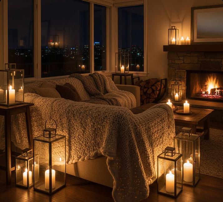
The 2026 accent wall is no longer a bright shock of color. It is a moment of deep texture or a commitment to a calming, saturated tone (like Forest Green) that makes the room feel enveloped and safe.
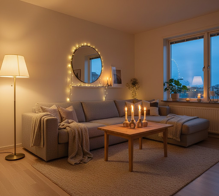
Color and Light Interaction
Always sample your paint colors. Colors look different depending on the light direction. North-facing rooms benefit from warm colors (like the Grounded Earth palette) to counteract the blue light, while South-facing rooms can handle cool tones. A paint color reference that discusses the interaction of color and light.
4. TEXTILES AND MATERIALS: BRINGING COLOR TO LIFE
Paint is just the start. The material you choose for your colored item dramatically affects the final result and coziness factor.
Textured Fabrics
When working with the Muted Optimism palette (Dusty Lilac, Buttery Yellow), use fabrics like velvet or a heavy linen blend. The texture absorbs and reflects the light differently, preventing the colors from appearing flat or overly bright.
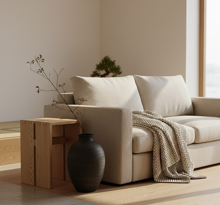
Natural Wood Pairing
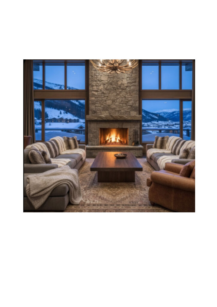
- Dark Woods (Walnut, Mahogany): Provides a dramatic, sophisticated contrast, especially effective when paired with the Restorative Greens (e.g., a walnut table against a moss-green wall).
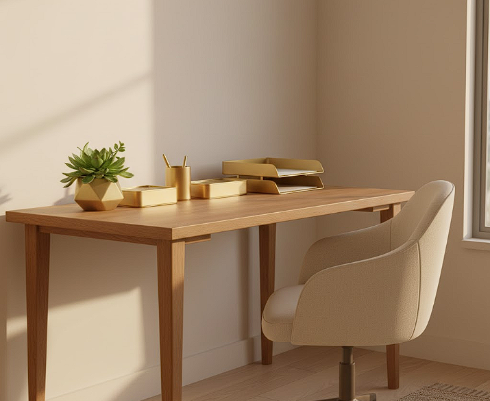
- Light Woods (Birch, Ash): Creates a light, airy, Scandinavian feel, perfect for lifting the weight of the Grounded Earth tones.
5. INTEGRATING THE NEW TRENDS
Simple, low-commitment ways to refresh your home with the 2026 palettes.
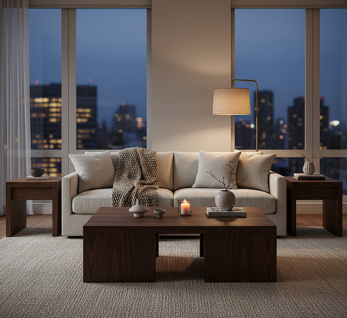
The 70% Neutral, 30% Color Rule
Start small. Keep 70% of your large surfaces (walls, main sofa) in soft neutrals (creams, ivories). Use the remaining 30% for your accent color of choice. A bold Forest Green armchair or a Clay-toned rug is a safe, impactful entry point.
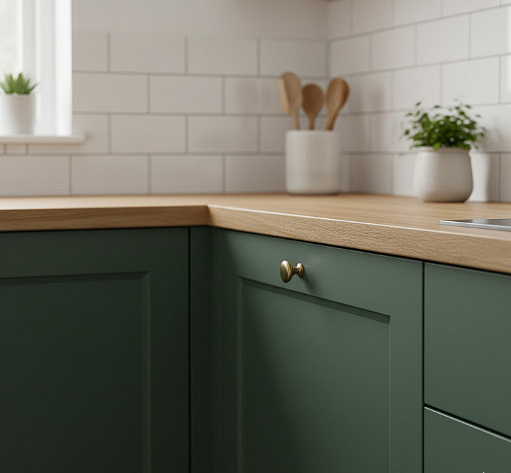
Kitchen Refresh
Instead of repainting the entire kitchen, consider painting only the lower cabinets in a 2026 color (e.g., Deep Moss). This creates an anchor and a cozy, two-toned kitchen look that is very popular.
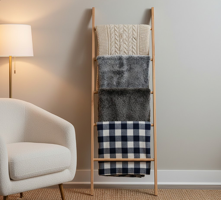
Seasonal Swaps
The easiest way to introduce new color trends is through low-cost, seasonal items. Switch out your throws and cushions to reflect the Muted Optimism palette in spring, and lean into the Grounded Earth tones for fall. Seasonal items.
CONCLUSION: COLOR AS YOUR COMFORT LANGUAGE
The Color Trends for 2026 offer a beautifully balanced vision for the cozy home, inviting us to create spaces that are both expressive and deeply peaceful. By strategically choosing shades from the Grounded Earth, Restorative Greens, and Muted Optimism palettes, you are curating an environment that supports well-being and aligns with the thoughtful aesthetic of Cozy Crafted.
Start small, trust your instincts, and allow the colors of tomorrow to bring new life and comfort to your space today.
Which of the three dominant color palettes—Grounded Earth, Restorative Greens, or Muted Optimism—will you introduce into your cozy home first? Tell us your plan below!


Respostas de 2